The new Blogger
For those of us involved in the project, we’ve been waiting months for this day to come. At long last, I’m proud to announce the launch of a project representing the latest collaboration between Stopdesign and Adaptive Path: the redesign of Blogger.com. Congratulations to the entire Blogger team on completing hundreds of hours, and expending tremendous effort to fit so much into this launch. This is Blogger’s first major overhaul since getting acquired by Google in February 2003, and it’s a biggie.
 For those of us involved in the project, we’ve been waiting months for this day to come. At long last, I’m proud to announce the launch of a project representing the latest collaboration between Stopdesign and Adaptive Path: the redesign of Blogger.com. Congratulations to the entire Blogger team on completing hundreds of hours, and expending tremendous effort to fit so much into this launch. This is Blogger’s first major overhaul since getting acquired by Google in February 2003, and it’s a biggie.
 The redesign includes a major reworking of Blogger’s home page and sign up process, and a new dashboard for logged in users. With this redesign, we focused on making the Blogger brand and interface much more friendly and approachable. The design features rounded corners, large icons, direct concepts, and helpful directions. Adaptive Path and Stopdesign worked with Google to pare down the sign up process (account creation), making it short, intuitive, and effortless for first-time visitors. We aimed at creating a structure and design that has as wide a range of appeal as possible. From the large base of Blogger’s existing users, to the multitudes arriving from Google on a regular basis who have no idea what the word blog means.
The Blogger home page now promotes the simplicity of creating a new blog by highlighting the short 3-step process. The page also presents a simplified definition of the word “blog” right up front, and directs new users into a short tour if they want to learn more. In addition to the site redesign, Google ups the ante for this relaunch by adding a slew of new features for their users: comments, user profiles, individual post pages, and conditional template tags. On top of that, they’ve significantly revamped the application interface to mirror the new look and feel of the site.
A few additional notes about the redesign:
New Set of Blog Templates
One of the new enhancements Stopdesign worked with Google to complete and include in this launch is the creation of a whole new set of user templates available for immediate use. Rather than have all templates created by Stopdesign, I thought it would be fun to expand the team involved. What if I asked other talented individuals I respected and wanted to work with to join me in designing brand new templates? I wanted to share in the responsibility of template design and creation, providing even more variety to Google and Blogger’s user base. You may know most (or all) of the names of those who graciously accepted to help me create these new templates:
A peek at a few of the new blog templates:
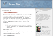
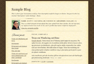
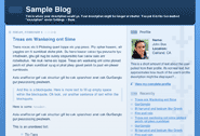
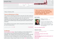
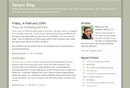
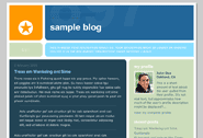
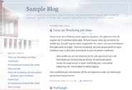
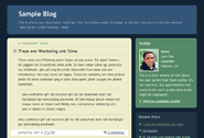
The full selection of templates (along with their full-size previews) are visible inside the Blogger application. You may see more from the individual template designer on their respective sites about the design choices and techniques each of them used. As for the impact of this part of the project, not only will thousands (millions?) of blog templates now be generated with more flexible, scannable, indexable, and standards-compliant code, but anyone throughout the world can now create an account, start a blog, and have a personal site designed by any of the talented gentleman listed above, all for free.
The Evolved Identity
![]()
 Sharp-eyed party-goers at the Blogger party in Austin during SxSW may have noticed the signage and multitude of free t-shirts they handed out which featured a new identity with rounded corners and a new type treatment to match. When we set out to establish the new visual identity of the site, we kept running up against the hard corners of the old Blogger logo, and the somewhat impersonal type treatment which limited the friendly qualities we were trying to inject into the brand. We didn’t want to push the logo far from what everyone knows — after all, the big orange B is widely known and loved by many a folk. Instead, we chose to evolve the logo, so it could take on a few new attributes. We sanded down some of the sharp edges and refined a few of the proportions, then carefully selected a typeface more suited to a product targeting the masses.
Home Page
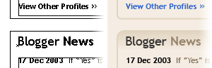
Visitors without Blogger accounts, or users currently logged out will see a different home page at blogger.com than users logged into the system. The logged out page provides answers to the question, “What’s a blog?” and highlights how short and simple the new account/blog creation process is. The logged in page presents a new Dashboard view. The Dashboard acts as an enhanced intermediary between the site and the application interface. It provides a customized view of the Blogger home page by displaying a quick overview of the user’s blogs, related profile information, updated blog content, and Blogger news. Can’t say what else is in the pipeline for additions to the dashboard, but users can most likely expect many more changes and new features in the near future.
![]() The new icons and buttons produced for Blogger (visible on the logged out home page and throughout the site and application) are intended to complement the amiable nature of the new brand. They pick up where I left off on a style I started using about six years ago for the Webmonkey Kids design. Some of the icons were sketched on pen an paper (ahem, numerous times). After finalizing an approximate look, the icons were drawn in Illustrator using a pressure-sensitive Wacom tablet and pen to create the base artwork, then cleaned up by manipulating paths and Bézier curves within Illustrator.
The new icons and buttons produced for Blogger (visible on the logged out home page and throughout the site and application) are intended to complement the amiable nature of the new brand. They pick up where I left off on a style I started using about six years ago for the Webmonkey Kids design. Some of the icons were sketched on pen an paper (ahem, numerous times). After finalizing an approximate look, the icons were drawn in Illustrator using a pressure-sensitive Wacom tablet and pen to create the base artwork, then cleaned up by manipulating paths and Bézier curves within Illustrator.
Design Execution
As true to the Design Process article, this project started with discovery and competitive analysis phases, led by the Adaptive Path team. I’ll let them go into as much detail as they want about the early process for this project.
Freeform exploration and brainstorming produced descriptive words, qualities, and elements to be used in the design. This was followed by tiny thumbnail sketches exploring loose layout and composition ideas. A few rough ideas sketched on paper made use of bold lines and thick rounded corners, which eventually led to the final design.
I’m using Adobe Illustrator more and more often for comping designs, and the Blogger design was no exception. It allows for easy object creation, manipulation, and resizing since everything is in vector format. I can easily move whole sets of objects, guides, and paths. The recent addition of the Effects menu allows me to apply a rounded corner appearance to each block without actually rounding those corners, as seen below:
(One gripe about using Illustrator for web stuff: after 11 versions, there’s still no easy way to simulate underlined text without manually drawing lines with the pen tool, then moving them every time the text reflows.)
A few clickable prototypes, several days of user testing, more tweaks and changes, and the down-and-dirty CSS work began. (Note: CSS didn’t really even enter the process until this final stage.)
Technical Insight
I won’t go into much detail here on technical details. But I will confess that this project is what finally prompted me to write about the IE Factor. The frustration of building a design in CSS and getting it to work across all browsers is certainly more apparent when you’re trying things you’ve never seen done or explained before. IE was the main culprit. Both Windows and Mac versions proved exceptionally difficult to bring into submission, but at least the Mac version had known workarounds and filters. Some of the features of the design (like the subtle background changes when hovering over the icons on the home page) were completely disabled for IE because they produced unintended and unacceptable results.
The rounded corners seen throughout the Blogger redesign (and in several of the user templates) make use of an expansion of the Sliding Doors technique written for A List Apart last year. The Blogger design is a fixed width, which means most of the modules of the site exist at pre-defined widths. Since the width of each module is known, one image is used for the top-left and top-right corners of a module, and another image is used for the bottom-left and bottom-right corners. The images are called in as background images for two nested elements. Since these two elements contain all the text of the module, they expand infinitely as the module grows in height. Think of it as Sliding Doors turned on their sides.
For modules requiring a border, the two images are modified to include top and bottom borders connecting the two corners. A third element gets nested in the HTML that uses left and right borders which connect top and bottom corners.
This design posed many other challenges when building it out, specifically because we wanted to allow the text and each of the design elements (header, modules) to be as flexible and scalable as possible. The markup construction was tricky and required compromises in several places. As is evident with the rounded corner modules, extra divs were necessary for each background image called in. In CSS3, border images will certainly help eliminate the need for extra elements. And I’ve been pressuring Tantek to get the CSS Working Group to consider allowing us to set multiple background images on one HTML element.
Wrap Up
As I have the habit of doing on product launch day, I’ve provided more than enough information for anyone to digest. I’ll close it off by saying that it was an incredibly fun project to work on. From the pleasure of partnering with incredibly smart folks at Adaptive Path, to the fun-spirited team at Google we got to work with, to the designers who agreed to help participate in a template project with little knowledge of the entire picture and, initially, not knowing who the client was.
This launch is a huge deal for Blogger. They may not have gotten everything right out of the gate, so I’ll cut them plenty of slack, and I would hope others do the same based on the number of improvements and enhancements they’ve made all at once. For instance, those who know my style and promotion of web standards may immediately try to validate the home page. I’ll save you the time and tell you it won’t validate right now. (If you’ve already visited Blogger and hit your Validate HTML favelet within a minute of seeing the new design, shame on you. Don’t you have better things to do? Aren’t there other things more interesting than making sure a new site launches with valid code the very same day?) A few simple omissions of closing brackets, and use of the target tag within a XHTML 1.0 Strict doctype is preventing the front page from validating right now. They’ll get to it eventually. Bear with them as they try to make sure everything else is working correctly for all the users who depend on the service to publish their thoughts and experiences to the world. Fixes and new features will most likely continue to roll out in the weeks ahead, so expect changes over time.
Overall, what a great project. Despite the frustration with browser rendering consistency that plagued us on the tail end of this project, it was still fun. Good client, good team, good product. What more could you ask for?
For the rest of the story on new features and changes, check out The Great Blogger Relaunch, which tells the story from their perspective.