Drive-By Shooting

9 June 2004

22 comments

In the first of a series, I present the original, undoctored photo used for one of the header images on Stopdesign. This one: the home page. There’s a story behind each one of them, which will help humanize the abstractions I’ve used for each header. This photo was taken while I was visiting Miami in November 2002 for the AIGA I|O: Interaction Only Conference. I dubbed it… The Drive-By.

Original photo for the header image of Stopdesign's home page: The Drive-By

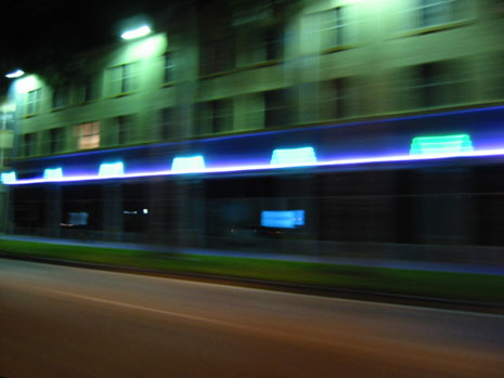
I think the building in the shot is some type of apartment building with retail space on the bottom floor. I was riding in the passenger seat with friends, Stacy and Kara Gary. (Stacy is a freelance photographer in Naples, FL.) They were showing me the sights and sounds of Miami since it was my first time visiting.

Temperatures were considerably warm that night. (90°F was the readout on a bank clock.) That’s nice for touring Miami at night, so all our windows were down. We were cruising along at about 45 MPH as I stuck my camera out the open window and snapped the shutter button. Thus, the original motion blur caused by the extended shutter speed of an automatic Canon PowerShot 300 with the flashed turned off. (I added even more motion blur for the header image.) A fluke that it came out so well. It was a joke that I was taking pictures at night with a point-and-shoot digital camera while moving at a decent speed. This shot became one of my favorites from the trip.

Posted in Locations, Personal, Site

22 comments (Comments closed)

1. At 8:15pm on 9 jun 2004, Marc Love wrote:

Holy crap Batman!

Doug, you never disappoint. The new design is simply beautiful. I was starting to wonder with the stripped down version, but now I’m blown away.

2. At 8:58pm on 9 jun 2004, Aaron Egaas wrote:

Great image. It makes me want to take my camera everywhere I go, or at least get a camera phone.

3. At 9:37pm on 9 jun 2004, Seth Messer wrote:

Just wanted to say once again Doug that I love your redesign and the photography you chose to “alter” is just fantastic.

Great job.

4. At 10:18pm on 9 jun 2004, Martijn ten Napel wrote:

The best pictures are always point and click images (all those famous Magnum images are most of the time just ‘lucky’ shots). The colour balance in the pic is wonderful, and so is the colour balance on this website.

5. At 11:04pm on 9 jun 2004, David wrote:

How did you get your post to display the thumbnail on the main page but the larger picture once you click the continue link?

Oh, and nice pic. =)

6. At 11:34pm on 9 jun 2004, Douglas Bowman wrote:

David (#5): The content on the home page is part of the entry Excerpt, whereas that on the entry page is part of the entry Body. So I can use two different images in each field.

Technically, I probably could have just used the one larger image in both places, then sized it down with CSS if it appeared in a narrow column. Something I may try next time, as I can target images conditionally based on the type of template and column in which they appear.

7. At 1:53am on 10 jun 2004, Lars wrote:

Great photo.

To me it’s that single lit window that really pulls it all together. It’s just in the right place.

I’d never have guessed it was Miami though, which in itself is a quality of the picture (and of most pictures taken in famous places).

You should make a series and call it “Beyond Art Deco: A Nightly Odyssey Through Forgotten Miami”, or something.

I disagree with what Martijn (#4) said though; a lot of the really great photos that look like they were just “pointed and shot” were (sometimes carefully) planned and/or staged.

For example, Robert Doisneau’s “The Kiss (1950)”, of a couple kissing on a Paris street, and Joe Rosenthal’s “The Flag Raisers (1945)”, of the flag raising on Iwo Jima, are just two well-known examples.

But they are still great photos.

8. At 5:33am on 10 jun 2004, Sam wrote:

The photo is very nice Doug, but your manipulations for use on the site are what really catch me.

I particularly like how you applied an adjustment layer (or like technique) to blocks of the image - a very nice contrast against the flowing movement of the images. And the streaking 1-px lines are a nice detail.

The white highlight that reaches up from the home link to the logo is a nice touch too (blue banner).

9. At 6:23am on 10 jun 2004, ken frey wrote:

that looks like it came out of a stock photography book… you should sell it! it’d take a really long time to get anywhere close to that using filters. perfect shot.

from my experience, though, i’d never let a browser handle resizing an image— even if the percentage of reduction was an even ratio— it always winds up hammering it. best to resize in photoshop, even though having 2 images isn’t as economical as only one.

10. At 6:33am on 10 jun 2004, theresa wrote:

i just love the colors in that photo! what a happy accident :)

11. At 6:52am on 10 jun 2004, Bryan Buchs wrote:

Doug (re #6): Isn’t that what they call a “dumbnail”? As Ken pointed out above, not only do you lose quality, but you’re unnecessarily loading data on that page. Granted, with higher speed connections, it’s not as big a deal, but still. Just my opinion.

Great work, by the way. Why is it that every redesign I’ve seen in the last few weeks makes me say “Oooh! I should have done something like that.”?

12. At 7:53am on 10 jun 2004, Mike Stenhouse wrote:

I go through phases of carrying my camera around with me. Normally it stops when I wake up after a night out and find several rolls of used film in the bottom of my bag and no clue what might be on them… Every now and again I turn up a gem but, generally, taking photos and drinking don’t mix awfully well! There’s only so many shots out of a bus window that one man can handle.

More relevantly though, I love the new redesign and, as an interior designer might say, the banner really ties the room together. I’d like to echo what Dan (#8) said about it - nice touches and great attention to detail.

13. At 7:56am on 10 jun 2004, Mike wrote:

Great photo.

I bet you’ll get a lot of hits from Google on this entry title, though probably not ones you’d appreciate.

14. At 8:19am on 10 jun 2004, Douglas Bowman wrote:

Yeah, Mike (#13) I thought about that after coming up with the title, especially in light of my recent entry about page rank. But I think it would be a shame to censor our own creativity for fear of being indexed.

This is exactly the type of post (or content) that I’d like to block search engines from indexing. It’s not really relevant for any searches about Miami, or especially the typical subject matter covered by a title like this. Some form of robots.txt and noindex that applies specifically to this page. Although the post shows up on other archive pages too.

It’s almost like (x)HTML would have really benefited by a <noindex> tag that you could either wrap around single phrases of text, or paragraphs, or even the whole page. (Maybe a noindex="noindex" attribute on the body element for whole-page cases.) Then it would just be a matter of setting up the publishing tool to automatically put those tags or attributes in the proper places if a pull down was selected to not index that entry…

15. At 8:38am on 10 jun 2004, Douglas Bowman wrote:

The other significance of this photo that I should have mentioned in the entry text itself:

My trip to Miami happened just after leaving Wired to start Stopdesign. We had just launched the redesign of Wired News a month prior, and Stopdesign started popping up on a few radars because of mentions from Zeldman, Meyer, and others.

So it was an exciting transitional time for me. But I was also a nervous wreck then. Not knowing if I had made the right decision to go out on my own or not. Stacy and Kara got an earfull of the combined excitment and intense anxiety. I spent an extra two days in Miami after the conference was over just to clear my head and think about the future of the business.

16. At 8:41am on 10 jun 2004, NateL wrote:

Great writeup. Excellent photo.

Another option for display would be to do some fancy stuff with the GD library for PHP. With this solution, you could create a PHP/GD function where you plug in your original image and then specify whatever size you want for the output. The handy, dandy GD function will then resize your image and output a binary one.

I did this on a Sacajawea site we created.

PROS: only one image on the server; can be resized any time, any place, any size, any number of times

CONS: harder on the server; a little slower loading (especially for huge galleries, like the one linked above); images are not cached (and therefore, must be recreated every time the page is loaded)

Anyway, it was something fun to do. Another possibility, I guess.

17. At 9:31am on 10 jun 2004, Chris Armstrong wrote:

I just began reading your blog about a month ago, but I have to say that your work really inspires me. I love the redesign (I liked the stripped down version, but after seeing this, I wouldn’t go back) and the picture is great. I’m nowhere near capable of creating your quality of work (yet), but you’ve definately given me somthing to shoot for.

18. At 9:59pm on 11 jun 2004, Zak wrote:

I love the redesign. I don’t know if you even thought about this (or maybe it was mentioned elsewhere), but I think it’s kind of cool that the name of the site is “Stopdesign,” yet the photos represent rapid motion. Seeing the title “Stopdesign” on the main page, it appears as though everything else is in motion while the title and logo are “stopped.”

I too have been inspired by your work ever since I came upon this site. I’m 16 and have been doing web design off and on since I was very young. This site has allowed me to take a really big step forward. Thanks for doing such an awesome job.

19. At 6:29pm on 13 jun 2004, Douglas Bowman wrote:

well, this sure didn’t take long…

20. At 8:46am on 18 jun 2004, Christine wrote:

Hmmmm…won’t there be a shocked look on the faces of those that put in that phrase and come up with your page! But the title fits the page. Could there be a “Neon Nights” in the future?

Lovely photo, I would love to see more of the ones from Miami. I was born and raised in deep South Dade and miss it terribly (I’m in Central Florida now).

Like the looks of the site, love the colors. Sage is one of my favorite. I would never have thought to put it with the navy/slate blue (on your comments), but it works! So, thanks for that inspiration.

Also wanted to say…Good Luck…on your upcoming speaking event in Oregon. Wish some of these events would come down to Central and South Florida again…then I could actually go to them. Would love to hear your talk about “Tables Are Gone, My Code Is Valid, Now What?”.

21. At 8:28am on 21 jun 2004, Mo wrote:

Nice picture… Very nice layout as well!

22. At 12:39pm on 27 jun 2004, Simon Chettle wrote:

Very nice photo. I just love the colours and positioning of all the elements. Its amazing that it came out that well from a point and shoot, especially from a moving vehicle!

I’m also surprised there’s no cars that got in the way, as that would of spoilt it, but this is very clean.

Love the picture, and the new design, very inspirational work there; just looking at it makes me want to pick up my camera.

Comments no longer open for this entry.

| Next entry


Upcoming Events

View all Events

Recent Entries

Latest links Subscribe to Stopdesign's Links feed

View all links

The easy way to manage projects: Basecamp
Recommended without hesitation for easy, web-based project management software.

196