Office shopping
Next in the series of photos used for header images on Stopdesign is a candid photo I never would have expected to make use of in any kind of design, let alone Stopdesign’s Company pages. There’s nothing spectacular about this photo at first glance. Maybe even at second and third glances. In fact, any other designer probably would have passed it over. This is… Office shopping.

Next in the series of photos used for header images on Stopdesign is a candid photo I never would have expected to make use of in any kind of design, let alone Stopdesign’s Company pages. There’s nothing spectacular about this photo at first glance. Maybe even at second and third glances. In fact, any other designer probably would have passed it over. This is… Office shopping.
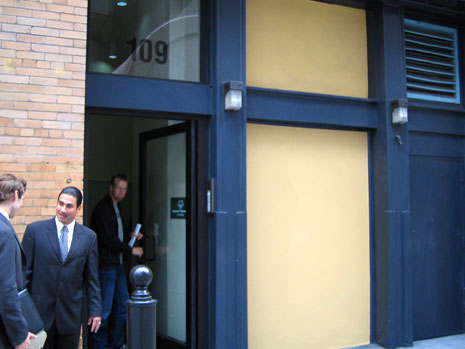
Stopdesign’s rent collectors at Adaptive Path and I have been hunting around San Francisco for larger, more flexible office space. A commercial real estate agent (pictured left in the suit, facing camera) was patiently herding us on a guided tour around downtown San Francisco, while we looked at pre-screened office spaces currently available for lease, interspersed with stops at Peet’s Coffee (necessary for the sustained endurance of office shopping).
This, folks, I guarantee is an entertaining adventure. Take a few designers, information architects, and user experience professionals. Show them wide-open, unobstructed office space. And you’re guaranteed to see minds churning, scheming and strategizing forty different floor plan layouts, then debating over every possible scenario for traffic patterns, collaboration models, privacy concerns, noise-level management, and of course, proximity to public transportation.
This photo was taken as we were exiting one of our more popular stops from the multiple afternoon tours. Sharp eyes may be able to identify the shifty character exiting the building behind the real estate agent. (Elvis has left the building.)
As I was using iPhoto to scan available imagery for the site design several weeks later, I accidently stumbled across the series I snapped when we were office shopping. I stopped on this photo primarily because of the muted color scheme which fit perfectly with what I wanted for company-related pages. There wasn’t much interesting about the photo until I zoomed in on the top-right corner, then rotated the image to create more dramatic lines and angles.
Reminds us that we can find potential beauty in the places we expect to find it the least — as long as shifty guyâ„¢ is cropped out…