A CSS Mosaic

22 July 2004

32 comments

Seattle was great. Period. I wish I could have stayed longer. The weather was incredible while I was there. Not a sign of rain or an overcast sky in sight. Throughout summer months in San Francisco, fog blows in late in the afternoon, often cooling down the temperatures into the 50-60 degree range by dusk. There’s nothing like being out and about on a warm summer night like those I experienced while in Seattle this week. I wish we had more of those in San Francisco.

Tuesday evening, after arriving late that afternoon on the same flight as Jeff, we met up for dinner with some former colleagues from our Wired/Lycos days, Dave Hendry (who now teaches at U-Dub) and Steve Mulder (in Seattle also to speak at the conference). We also conned a local friend, Tim, into joining us to help pick a place for dinner. We ended up at the Palace Kitchen on Fifth Ave. (Which I heartily recommend, by the way. The food was excellent, and the five of us walked right in without a reservation.) Wednesday evening, Nick and Crystal kindly took me to dinner just a block from my hotel (to save me from needing to walk too far). Later that night, I joined Jason and some local cohorts of his for drinks out on the back patio of Elysian, where we enjoyed the previously-mentioned warm summer night, exchanged stories of working with large companies, then drove nearby to see the oddly non-signed mostly-unidentified building of Amazon.com. Earlier today, after an ever-so-brief visit to Seattle’s new Central Library, just before heading off to the airport for my flight, I met up with Mike Davidson for lunch at Jackrabbit.

The two presentations I gave on Wednesday went over well, generating lots of interest from the audience. The first presentation I gave on Beautiful Interfaces with CSS had lots of new visuals in it. Many of my text-heavy screens from the last time I did this presentation are now replaced with screenshots, diagrams, pictograms, and photos that demonstrated my talking points. I was a little nervous about the second presentation (on tableless design), since I didn’t know how well I could pull off a complete redo of a well-known table-heavy site in under an hour. The second was just as successful as the first. I’ll write a little more about the second presentation in a follow-up entry.

Thought I’d share one of the images I created for the first presentation. Paul Scrivens maintains (and constantly expands) an excellent showcase of recently-launched or redesigned sites that use CSS extensively in the CSS Vault. Obviously the Vault can’t (and doesn’t) document every single CSS layout that launches. But the collection is impressive, nonetheless. After obtaining permission from Scrivs, I grabbed screenshots of the last 144 sites (at the time) that had been added to the Vault over the last four months, and assembled a random mosaic that shows the rapid expansion in the popularity and use of CSS in a broad spectrum of site design.

The images were added to the mosaic in reverse-chronological order, following the order they were added to the Vault. The top-left corner starts just a few days ago with 456 Berea Street, and works backwards in time, ending somewhere in March (2004) with Eview 360 at the bottom-right. Perhaps you can spot a familiar design or two…

Mosaic composed from screenshots of 144 sites added to the CSS Vault within the last four months

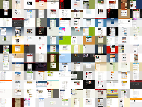
(Note: Image above links to a page displaying a much larger 376 KB JPEG image, 1200x900 in dimension, which is still only 50% of the size of my original.)

Update: Steve Smith heard the call and answered: the larger image now uses a complete image map to make every portion of the mosaic clickable to the appropriate site. Thanks Steve!

Posted at 9:00pm in CSS

32 comments (Comments closed)

1. At 9:27pm on 22 jul 2004, Aaron Egaas wrote:

I look forward to seeing my co-worker’s notes who went to your presentations on Wednesday. Hopefully she’ll be convinced to stop using tables!

2. At 10:48pm on 22 jul 2004, Mike wrote:

Wow, I’m honored to have designed two of the sites up there, thanks a ton Doug.

Always nice to see a late-night post from ya ;)

3. At 12:46am on 23 jul 2004, Scrivs wrote:

Like I told you before Doug, just glad I contribute to the cause in the little way that I can. Mad props go out to you and the other 23448394343 people using CSS to create these beautiful sites that I am able to showcase on my site.

4. At 1:28am on 23 jul 2004, Craig Mod wrote:

Your mosaic is particularly interesting. It reminds me a lot of the work done by new media artist Jason Salavon.

I think we’re all aware on a peripheral level that most CSS sites share many common characteristics — centered columns about 700 pixel wide, for instance — but it isn’t until you produce an image like you have above that this idea becomes so clearly illustrated.

5. At 2:25am on 23 jul 2004, Thomas Hammer wrote:

I guess Doug has to take some of the “blame” for the emerging trend of 700 pixel widths that Craig Mod mentions. The previous version of Stopdesign was one of the best examples of liquid layouts out there. Now we don’t have that to look up to.

That said, I also think the new version of the site is even better than the previous. Great work!

The CSS mosaic also shows a dominance of rather gray sites. Maybe a little more color wouldn’t hurt? Or perhaps the miniature versions don’t do the sites justice?

6. At 2:55am on 23 jul 2004, Ian Firth wrote:

144 sites, and they all look the same…

They all look good, but I’m waiting for the next-big-thing to come along and bump the “big pointless header graphic and a long skinny column of text set on a trendy background” look to the side.

I miss the creativity of the 90’s.

7. At 3:56am on 23 jul 2004, Siddharta Govindaraj wrote:

Ian, I was thinking exactly the same thing. You hit the nail on the head with your comment. A mosaic like this just brings to the forefront the fact that all sites look pretty much the same after all.

8. At 4:10am on 23 jul 2004, Joachim wrote:

wow, I’m hohoured to have my resume site in that mosaic!
thanks a lot, Doug =)
I am too disapointed by the ‘unoriginal’ design and, well I try to change things : look at my site, it’s horizontal, it’s “real” textures…
This kind of experimentation is too rare, but people could do a lot better than me if hozirontal designs were ‘hip’ ;-)

9. At 5:22am on 23 jul 2004, Steve Smith wrote:

The only thing I’ll agree with Ian and Siddharta on is that many of the sites use a similar format. But that does NOT make them all look the same. Sure they have a family resemblance, but that gives them all a level of familiarity and ease of use.

Saying that all sites look the same because they are centered, fixed width, large header etc. is as false as saying that all automobiles look the same because they have 4 wheels, an engine and the driver sits in the front-left. I believe many sites have this format because it works - and it works well. I believe creativity can still be used while maintaining a well-understood and accpted form factor.

That said, I do enjoy sites that break this mold, but I also enjoy seeing the many ways it can be refined.

10. At 5:49am on 23 jul 2004, Tim wrote:

@Ian

What you call creativity I call an over-“designed” mess. I put “design” in quotes because a lot of styling went into those sites, but not a lot of design, in the design-is-more-than-just-visual sense.

See The Bathing Ape Has No Clothes for more details:
http://alistapart.com/articles/bathingape/

I’m glad we have more usable sites that conform to conventions that are not ugly either. At the end of the day, people have to *use* a web site, to *do* stuff, so no amount of spinny, whizzy guff is going to help them accomplish that…

Good, clear design, however, will.

11. At 7:23am on 23 jul 2004, Dave Simon wrote:

I’m tired of those darned book things - they all seem to have the same format. Table of contents. Chapters. Pages. Black text on white pages. Boooooooring.

Web design is an evolving art, but we’ve also found some things that “just work.” To say these sites all look the same is akin to saying that a Yugo and BMW are exactly the same because they have steering wheels, brake and gas pedals in the same general placement.

Not to say we can’t be more creative with our work - but not every site needs to reinvent the wheel either.

12. At 7:42am on 23 jul 2004, markku wrote:

Wow, my site is IN the mosaic! Woohoo.

But looking at each site, we can see recurring patterns that are almost always, present. Not that it is a bad thing, but I guess there hasn’t really been much new ideas on how to serve content in a much different way.

13. At 8:30am on 23 jul 2004, kartooner wrote:

Very cool to see my site design among all of these beautiful CSS layouts included in this graphic.

In regards to the discussion about the use of a header and 2-column layout, as Dave Shea mentioned in his blog, it just works. There is a reason so many designers have adapted this design and that’s because it presents the information in a simple and yet streamlined manner.

14. At 8:44am on 23 jul 2004, Douglas Bowman wrote:

I think the comments that all these sites look the same are interesting, because a lot of them do at this size. The only thing that sets them apart when they’re scaled down this small are large distinguishable blocks of color or imagery. However, seeing the full-size version of the site after seeing a thumbnail version is often enlightening. Some have lots of details worked out that you can tell a lot of thought went into. Others, once I see the full-size version, don’t look as hot as their thumbnail disguised them to be.

Some of you made an analogy to cars. Imagine if you picked 100 different car makes and models, and found their MatchBox™ car equivalent [1], placed them on the ground, then stood up and looked at them from five feet up (or however tall you are). A lot of them would look much more similar than when you’re walking through a parking lot of real, life-size cars.

Seeing sites as these small “patches”, some of them are easily identifiable, others not as much. Depends on your familiarity with the site’s general look. Some of them are interesting when made this small — enough so that I want to see what site it is, and what it looks like full-size.

We could go hunting back through the Vault to find the gallery image that looks the same, but… Anyone want to generate the code for a client-side image map so that every portion of the image points to the appropriate site?

* * *

[1] For those not familiar with MatchBox cars, they’re tiny toys (or collectors items), about 2.5 inches long (or 5 to 6 centimeters) — about the size of an actual matchbox — that are molded and painted to look strikingly like actual car models. Obviously a lot of the detail in design is lost when going to something that can easily fit into the palm of your hand.

15. At 8:48am on 23 jul 2004, Eris wrote:

Books, Newspapers, Magazines, that expense report I got yesterday…

In terms of displaying copy, what is the primary goal? That the person visiting the site actually stays on the site and reads it. Innovative is nice, but if you frustrate your readers, if you make their eyes dart all around the page looking in vain for information, how long are they going to stay on your site? And what are the chances that they’ll return?

It’s never just a matter of Design or Usability. It’s a balance of both.

16. At 9:04am on 23 jul 2004, Geoffrey wrote:

Most of these sites are about reading. They look no more the same than books on a shelf do. If somebody creates a book that weighs 85 pounds and and must be read sideways, it might be interesting for a minute, but then you have to read the damn thing.

17. At 9:13am on 23 jul 2004, RMCox wrote:

It would be interesting to compose a similar mosaic in one years time for comparison — or even in 6 months time, given the rate of redesigns lately.

It seems to me that a lot of the initial representations of standards-based sites have been personal blogs — where one has the freedom to redesign, get feet wet and experiment with standards. However, that type of information presents inherent limitations with respect to how it can be represented efficiently. What those blogs did though, was refine certain elements (as Steve notes above, #9) to really exceptional levels, so those elements get repeated having already been distilled to a fairly pure form. If you look beyond the mosaic, and poke around the actual sites included in the mosaic, you will see a few repeated elements, sure; but you’ll also see the evolution and expansion of those elements in addition to the inclusion of the new.

What I envision, though, is that as these experiments demonstrate success, standards-based designs will propagate into that person’s daily development cycle and the opportunities to design around a multitude of different information structures will emerge and traditional elements, while still useful and important, will be relied upon less and less.

18. At 9:29am on 23 jul 2004, Rob Mientjes wrote:

That’s exactly a thing that must not be underestimated. If it works, why try another format? Well, two reasons: you want to try if something else works too (and then everyone uses it :P) or you want to be ground-breaking with your design, however, no-one can navigate it as it is too unfamiliar and unlogical. Not too mention the horizontal scrollbar ;)

I blame myself of creating another standard site, and I’m currently working out a new way to display my content, which will be nice. I’m sure it’s not going to be ground-breaking. I just want a site that is easy for my visitors (Most of the visitors are those standard WinXP/IE6/MSN/KaZaA-people. Ah well, you get the point!) and that works. And it works. But it’s just not nice. Of course, as a designer you want to create something that is refreshing, but it must not cause a completely strange site, where everybody complains about the logics, but ‘it looks great’. Not quite a comforting ‘compliment’.
As Dave Simon wrote, the book has a way of displaying its content, and believe me if I say that it is attested, as it works for some 500 years now. Some formats are good, and they should be used to keep the web easy for everyone (at least most of the people). Now innovate and add your nice dough, people!

19. At 9:53am on 23 jul 2004, Steve Smith wrote:

I have the Image Map created and posted at http://www.orderedlist.com/demos/css_mosaic/.

Doug, please feel free to take the image map and apply it to yours as I don’t want to steal your wonderful creation. Thanks for the challenge and your work.

20. At 10:13am on 23 jul 2004, Douglas Bowman wrote:

Wow. Fast work Steve. The version here is now updated with the image map as well. Now the image is even more interesting, since we can click directly on a portion to view the actual site. I’ll note this above too. Thanks!

21. At 10:28am on 23 jul 2004, JackL wrote:

Doug,

Do you and your ‘peeps’ decide where to eat by pulling up a browser and checking which eatery has a place on the net?

What’s up with all of these dining sites?

Yours truly,
Jack L

22. At 12:37pm on 23 jul 2004, David wrote:

Eris wrote, “It’s never just a matter of Design or Usability. It’s a balance of both.”

I have to completely disagree. Design IS usability, or the attempt to solve a problem thereof. You’re confusing design with style.

The former deals with presenting information in an accessible way. It involves getting around constraints imposed by the medium or some other factor. The latter deals with its aesthetics, which is not to say aesthetics are less important. Merely different.

Until, of course, the aesthetics begin to impinge on the accessibility. (Light blue type on a paisley background, anyone?)

But to raise something more than what might be argued as quibbling over semantics, there IS a design issue here, in that the most typical example of sites that present this appearance is the average web log. Do I have to use that other word?

They are generally designed as if intended to be read by constant readers, who are tuning in to see what’s new today. They work well for that audience.

They work less well if one wants to read the whole thing from the beginning. For one thing, they’re organized upside down, in chunks. There’s a sort of jerky discontinuity in reading the archives. One goes, say, from the entry for the first of June at the bottom of one page, to the entry for July 31st at the top of the next.

It’s not a big issue, but it is an issue, and a design issue, rather than a stylistic one. It is not impossible, or even difficult to solve, given the data-driven nature of most such sites. But it does point to a flaw when looking from the viewpoint of a different audience.

23. At 2:42pm on 23 jul 2004, Ian Firth wrote:

Well, after perusing many of the links in the image map version (too lazy to go back through the Vault), I’ll back-pedal on my comment and say that a much smaller percentage of the sites are similar.

I’m still waiting for the next change in blog look and feel, but maybe there doesn’t need to be one.

24. At 6:28pm on 23 jul 2004, jay wrote:

I just sat through all 3 days of the Seattle conference and must say that Doug Bowman had the most intersting insite as to why css is so important and why we should even be attending such a conference. I was quite disapointed with days 2 and 3 in the Web Design room because the philosophy of css and web standards wasn’t expressed at all. I thought you stole the show. Way to go.

25. At 9:34pm on 23 jul 2004, Siddharta Govindaraj wrote:

This comment is rather long, so please bear with me. I hope you wont skip this comment beacuse its so long ( tip to myself : keep comments short or no one will read them :-) )

After going through most of the above comments, I have to agree on a few points. I do agree that there are some things that work, and that is why they are common to every site. I also agree that like the table on contents in a book, or the wheels in a car, we have come to standardise certain elements standard locations.

However, having said that, I do think that there are a few important differences.

If we were to categorise what constitues an essence of a blog, we would come up with elements like the blog content and the comments. These two elements constitute the essence, and without any one of them, the site is no longer a blog.

Next, comes the design of the blog. By design, I’m going to take the definition of the above comments that design does not equate to visual design and style. Design is about usability and constraints such that the user can accomplish his goal. By adding usability contraints, we can come up with a few more elements which are essential to the website. We need links to previous posts, a search field, and a way to see posts from a particular date (the calendar view). We also come up with the contraints that the text be easy to read, and comments easy to find and reply to and so on.

Next, we come up with the visual design. The visual design determines the placement of both the essential elements and the usability determined elements upon within some contrained amount of space. How do I arrange these elements so that it satisfies the above constraints ? It is concerned with placement of the elements.

Finally, to use the terminology in the link provided by Ian, we come to the styling of the site. What colour scheme ? What patterns ? Should I change colour for hover on links ? My interpretation is that this is also what Doug meant in this comment, when he is was commenting on the differences in the sites. All sites have the same visual design, they are only stylistically different.

Now, I feel that provided the visual design uses all the essential elements, and satisfies all the usability constraints, you are free to come up with any site you can think of. This is all about aesthetics.

The long skinny site is is a visual design. I do agree that the essential elements, and the usability contraints MUST be maintained, no matter what happens. However, visual design and style can be varied. Now, looking at the sites in the mosaic, we see that they do use different styles, and some have put in a lot of thought into it. But the visual design is exactly the same.

We must now ask the question, given the essential elements of a blog, and given the usability contraints, is the long skinny site the only one that satisfies it ?

I think not. IMHO, the long skinny style is a trend. In fact, the liquid design satisfied all these contraints as well. Like fashion, the long skinny visual design is a trend which sites copy in order to not have to spend hours coming up with something new and innovative. Those hours are what seperates the true innovators from everyone else.

I’m sure that in a few years time, we are going to see something different, and every site will have that design, and we would be all sitting around how that visual design is the most optimal one.

PS: Regarding the calendar view, I must confess that I have never used the calendar to find posts. I use the recent posts link to find posts that I might have missed over the last couple of days, and use the find button to search for a particular post. Is this the same for you as well ? Maybe a study to determine if the calendar view is really useful could be interesting. It might just be a case of every site copying the calendar view, because every other site does it. Of course I have not really thought done any serious study on it, so I might be wrong.

26. At 12:08am on 24 jul 2004, andrei smirnov wrote:

well. it seems to be the question of time and effort, indeed. i won’t be happy to think of the rectangled-block-page-layouts in the mosaic in terms of trends and fashion. (people in the mosaic seem to be pretty talented not to be able to invent something really innovative.)

one more observation (from the real life, though). it seems business sites suffer much less from this annoying similarity. bloggers (including myself) simply don’t have time to polish their design ideas at their personal places. so, in the long run, blog designs are sure not the best thing to take for a model.

we all know that complex liquid layouts are much harder to develop meaning they have to be usable, aesthetically attractive, resolution-independent and cross-browser compatible.

anyways, this ‘liquid’ challenge is probably really worth accepting and dealing with in the web-design community.

27. At 5:50am on 25 jul 2004, Laurens Holst wrote:

So many fixed-width layouts… sigh…

~Grauw

28. At 7:53am on 25 jul 2004, JackL wrote:

Laurens: Fixed width works, and works especially well for blogs. Your fluid width site, for example, is not reader friendly. I can read and scan through Douglas’s posts with ease because he has a well proportioned content area.

Your site, and most fluid sites that allow the main content text to stretch, is harder to read without strain and boredom. You have to strike a balance with line lengths / words per line.

Mezzoblue, on the other hand, is an exception. He did a great job with a fluid layout.

Again, fixed and centered layouts simply work and make it easier to read and scan information.

29. At 10:22am on 25 jul 2004, Geoffrey wrote:

Yeah, with my 1440 screen resolution and a fully expanded browser, the Grauw site is seriously unreadable. But this argument has probably seen its day. Readable line-length or flexible layout? There are advantages to both, but one method seems to be more popular, perhaps it works. Or maybe it’s just a fashion trend inspired by designer apathy and lack of time.

30. At 11:42am on 29 jul 2004, Arthur! wrote:

What if this is as good as it gets?

31. At 10:04pm on 8 aug 2004, Mitchell wrote:

No doubt these are for the most part, all usable, clean beautiful designs. Css and the new creative use of style is in evidence in all these designs. I’ve worked as senior designer with guys who say the “frozen” solution IS hip these days and the way to go. But man, look how looooooooong this blog is. Uggghhh!

Is it really the best solution? Ive worked with allot of clients and allot of sites and despite the designs problems arising from a flexible site, Im still a huge fan of it, and can’t say I really truly like being in any of the spaces created by the sites you show here. Why? Simply because you just are not using the viewport space wisely and efficiently….in fact, its a waste, man!

There was a site by Hillman Curtis at studio.adobe.com that used to be online that was gorgeous, and filled the whole browser window with text and color and navigation. You could “breath” and dream big dreams in that space and one got the feeling that even as the text grew in the expanding site (making the page less scrollable) that it was more readable and usable as well. These narrow 700 pixel sites remind me of the look of “Print Preview” in the browser or Word. Go check it out in your browser and you will see what I mean. There is a reason why in desktop publishing programs, for the most part, most people I would guess type and read those docs so that the white of the pages fill the monitor window. Same for a standard 8.5 x 11 inch page. The web isnt the same medium, I know. But in a site with volumes and volumes of multi-column text I think its a sad waste that our CSS solutions come down to that narrow column solution, and not more “full view” designs.

I mean, look at all the wasted space to the right and left of this column of content? Cant that space be better used? (Im assuming your resolution is wider than 800 pixels, which for some may not be true) Can you do that so that people with low and high resolutions both can see all the content without scroll bars? - MS

32. At 9:48am on 15 aug 2004, Misty wrote:

Designing a web site needs to rely on what the web site offers, not what the current “hip” thing to do is. Horizontal scroll or fluid layouts may work for a more visual presentation, but for sites that have a lot of written content, the narrow longer layout, in my opinion, is more user friendly.

I’m a web site user, so I don’t know the “rules of web design” as well as some of you might. But, I know what pages I’ll stick around to view and which ones I won’t.

This site obviously kept my attention. Isn’t that the purpose, Draw in the user and keep them interested? If all of these comments had been spread out from far left to far right, I would have left a long time ago. Mile wide sentences cause headaches.

:o)

Comments no longer open for this entry.

| Next entry


« July 2004 »

Sun Mon Tue Wed Thu Fri Sat
        1 2 3
4 5 6 7 8 9 10
11 12 13 14 15 16 17
18 19 20 21 22 23 24
25 26 27 28 29 30 31

Recent Entries

Latest links Subscribe to Stopdesign's Links feed

View all links

637